Responsive Image Handling
A famous Russian writer Ivan Turgenev wrote, “A picture shows me at a glance what it takes dozens of pages of a book to expound.” This is exactly the same trend that can be seen in current websites. Pictures and visuals overpower the text on these websites.
But, this comes at a cost.
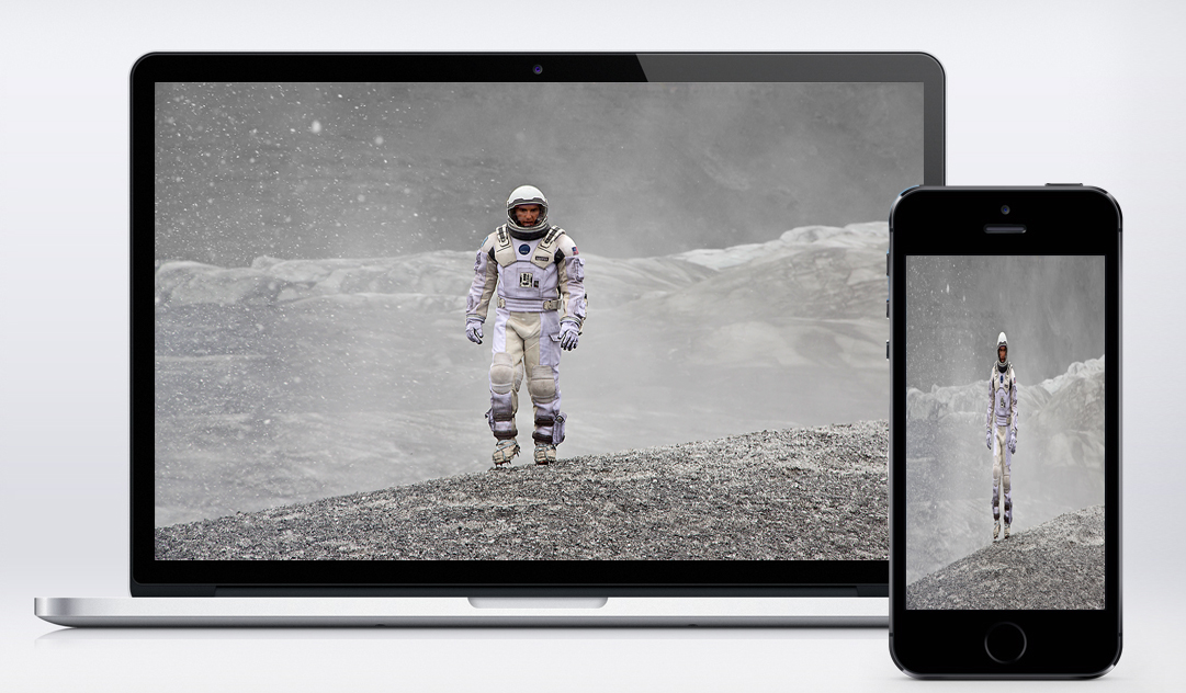
Non-responsive Image:

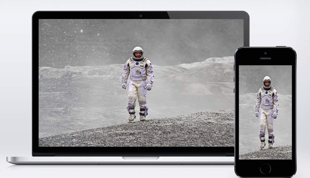
Responsive Image:

Responsive design is getting more attraction with more and more users visiting websites for mobile devices. However, loading high quality image for high resolution display and serving lower size image for low bandwidth is equally important.
“Responsive Images” deals with serving different images based on parameters like devices, resolution and viewports.
Challenges:
-
“Art direction” problem:
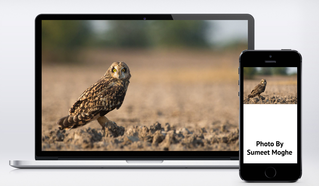
It is not always acceptable to serve same image with different resolutions based on device type. Some images don’t scale well, focus can be lost

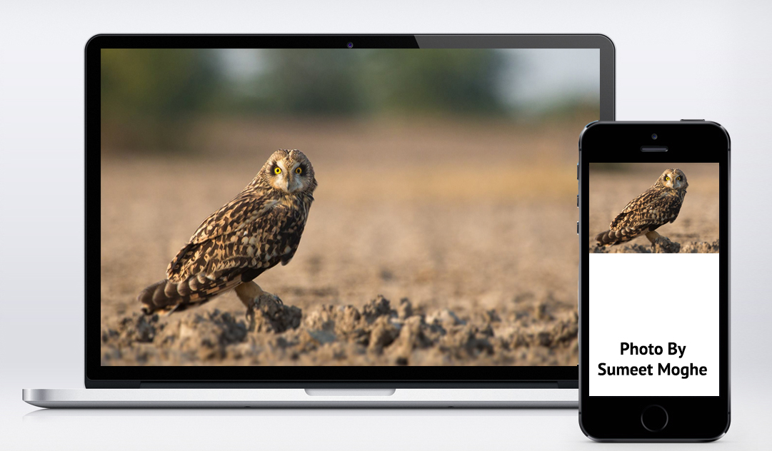
In order to be able to appreciate the bird’s beautiful characteristics on mobile, the photo would have to be zoomed in, cropped and focused on the bird. To solve this problem, we need a responsive image solution that enables you either to specify different versions of the image for different situations or to adjust the image on the fly.

-
Bandwidth detection problem:
Check the bandwidth of user and server different quality of images for low, medium and high bandwidth.
-
Performance problem:
One way to improve performance is by lazy loading of images. Load images within the viewport and images outside the viewport will not be loaded until user scrolls to them. unveil.js exactly does the same thing
Solutions:
-
Client-side
Image will be selected from a set of images according to the breakpoint and bandwidth. Breakpoint is based on the device width and is used for targeting devices e.g. desktop, tablet and phone.
Breakpoint MinWidth MaxWidth Phone 0 480 Tablet 481 768 Desktop 769 Screen available width As shown below, we can have image for each breakpoint and select one accordingly
To solve the art direction problem, image can be cropped and shown
Below is the javascript snippet that scans image tags and selects the url according to the breakpoint and assigns it to src attribute of img tag
Performance problem can be solved by doing a speed-test and storing that information in cookie/localstorage which can then be used before requesting any image
Following are the existing client-side solutions:
Apart from above mentioned solutions, I have created a prototype for the same,
View source on Github: https://github.com/akshantalpm/responsive-image-handling
-
Server-side
Server side solution uses visitors screen-size for rescaling images which are embedded on the page being served.
Visitors screen-size information can be stored in a cookie/localstorage on start of page-load and this information can be used at the time image is requested.
No markup changes are required, it works on legacy website. Added advantage of using server-side solution is of maintaining only one image file.
The disadvantage with this solution is images which are not in viewport will also be loaded at the time of page load, resulting into delaying page load.
Following are the existing server-side solutions:
- open-source solutions:
- SaaS solutions: